Application Form Templates
Application forms are essential for collecting candidate information during the hiring process. While forms can be created from scratch when setting up new positions, it’s often faster to start with an available template and customize it as needed. The system provides a default template for each language, and users can also create additional private or public templates depending on their role.
Creating and editing templates
When adding or editing an application form template, details are organized within a popup window divided into three sections. Changes are only saved upon clicking Save.
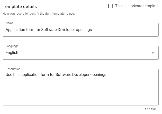
Template details
This section includes fields common to all templates, such as Language, Name, and Description. Set the language before adding fields to ensure compatibility.
⚠️ Note for Admin users
When creating a new template, you can mark it as private using the checkbox in the top-right corner. Once saved, this option cannot be changed.
Custom texts
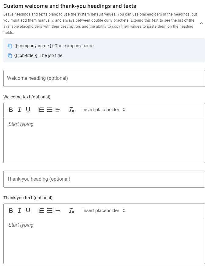
This section lets you customize the messages displayed to candidates before and after they complete the form. While default Welcome and Thank-you messages are provided, you can customize headings and text as needed.
You can use placeholders, listed at the top of this section (click the expand icon), for dynamic content. To copy a placeholder, click the icon next to it.
Form fields
Predefined fields
Each application form automatically includes First Name and Last Name. In the Available Fields panel, over 30 additional predefined fields are grouped by category, which can be added to the form by clicking the plus icon.
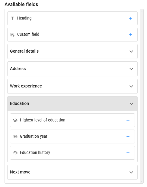
Most fields are presented as standard inputs (e.g., text boxes, checkboxes, dropdowns). Some, like Work History and Education History, allow candidates to enter multiple records with multiple attributes. Profile Image lets candidates upload and crop an image.
To edit a selected field, click on it to view its details in the Settings panel. Each field has a default label, but you can customize it and add a hint, displayed under the input field. You can also mark fields as required. For Work History and Education History, additional options allow you to request more details from candidates.
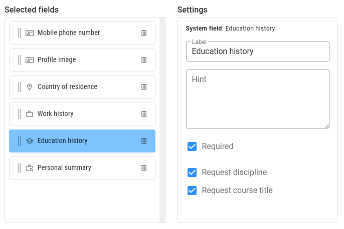
To remove a selected field, click the Delete icon to its right. To reorder fields, drag and drop them using the Dots icon.
At the top of Available Fields, there are two special options that can be added multiple times:
Headings
A Heading is not a data field but helps organize the form into sections. You can add, remove, or reposition headings, which are shown in bold to distinguish them from fields.
Custom fields
Custom fields allow you to add any other fields not available as predefined options. You can choose from several types, including Checkbox, Number, Date, Single Choice, Multiple Choice, Single-line Text, and Multi-line Text. Choice fields require at least two options, and you can choose the UI component type (dropdown, checkbox, or radio button). To add options, scroll to the end of the Settings panel.
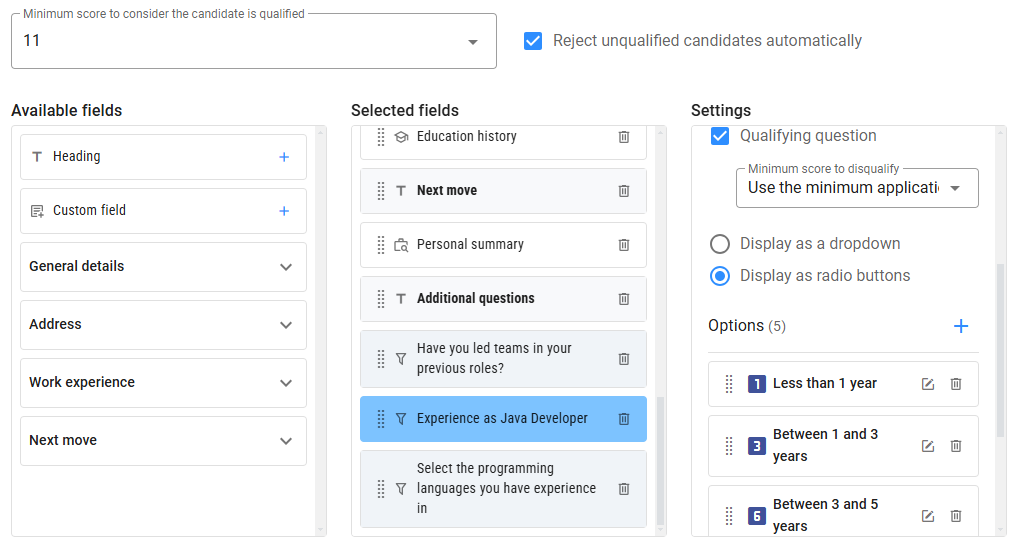
Pre-qualify questions
Checkboxes and choice questions can also function as pre-qualifiers by enabling the Qualifying Question option. You can assign scores to checkbox questions or options within choice questions, allowing you to screen candidates based on their answers. Qualifying questions display a funnel icon for easy identification.
A minimum score can be set to qualify candidates using the Minimum Score to Qualify dropdown at the top of the section when there are qualifying questions. Besides setting a minimum score to qualify candidates, you can also disqualify candidates based on specific answers to qualifying questions. When using pre-qualifying questions, you can choose to automatically reject candidates who don’t meet the minimum score or who give disqualifying answers by checking Reject unqualified candidates automatically.
Preview
You can preview the application form as candidates will see it by clicking the Preview button at the bottom left of the form. The preview consists of three views:
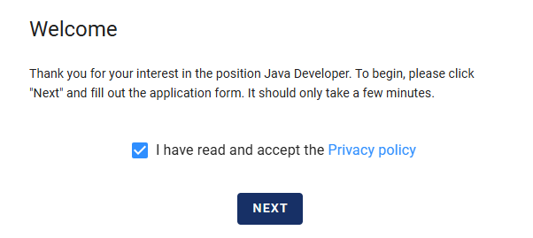
Welcome view
This initial view displays the Welcome heading and message, along with a checkbox for candidates to accept the Terms of Use, which must be selected to proceed.
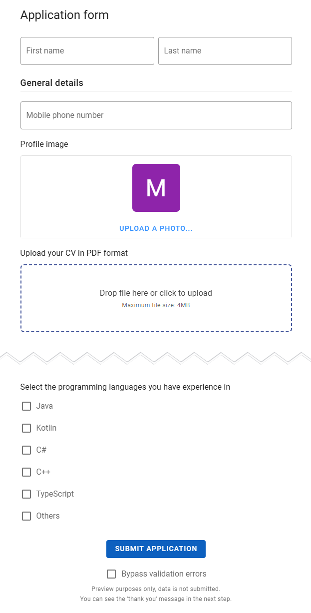
Form view
The second view displays the application form in full. Here, you can test headings, fields, and validation rules. To bypass validation errors and move to the next view, check the Bypass Validation Errors box.
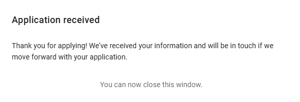
Thank-you view
The final view shows the Thank-you message and heading, providing candidates with a closing message.