
Using the Portal Designer
The Portal Designer in Zamdit is a no-code tool that allows organizations to create and customize their Career Portal effortlessly. Using an intuitive drag-and-drop interface, you can design a professional, branded portal that showcases open positions and enhances the candidate experience. From page layouts and visual elements to custom HTML components, the Portal Designer offers unparalleled flexibility, enabling you to align your portal with your organization’s unique identity—all without requiring technical expertise.
User Interface overview
The Portal Designer is divided into three main sections:
- Action Bar – Access primary functions, such as adding rows, saving changes, or previewing your design.
- Design Tool – Customize your portal by adding content elements and adjusting their settings.
- Design View – Drag and drop content elements to see and edit them as they will appear in their final format.
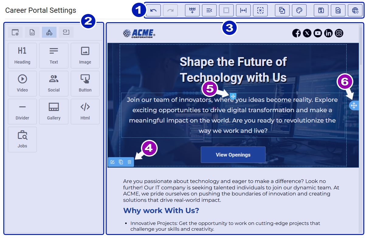
The Design View is interactive, responding to mouse hover by outlining underlying elements. This allows you to reposition elements on the page by dragging and dropping them. A floating menu bar also appears for performing quick actions, such as editing, cloning, or deleting rows.
- Floating Menu Bar: Offers options to edit, duplicate, or delete the outlined row.
- Element Handle: Displayed at the top of each element for repositioning.
- Row Handle: Located on the right of each row, allowing you to reposition rows.
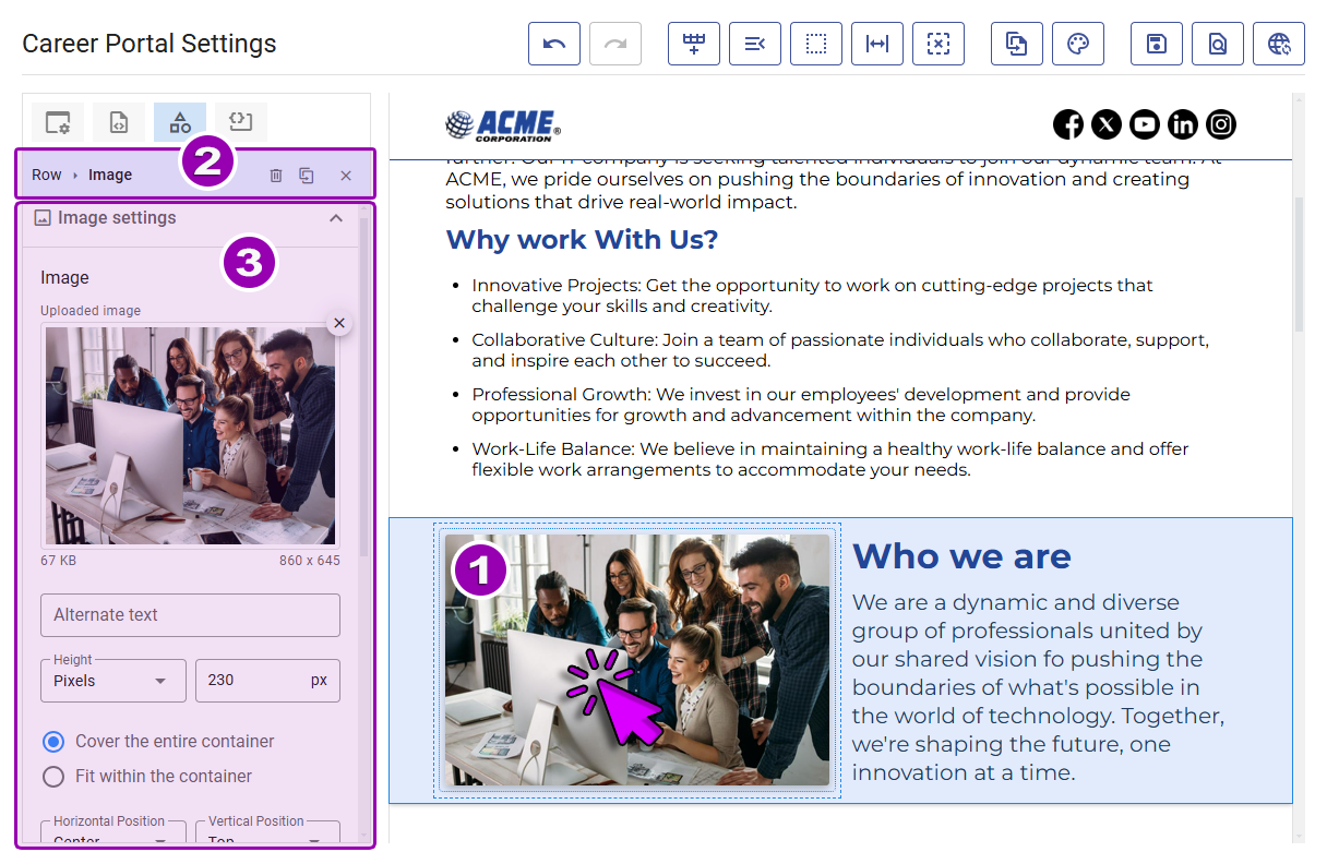
Clicking on any content [1] outlines it with a dark border, highlights its parent column and row, and displays its settings in the Design Tool. The top bar [2] of the Design Tool shows:
- A breadcrumb trail for accessing row settings.
- The type of selected content.
- Icons for actions, including a special one for clearing the selection and closing the content settings panel.
Use this interface to customize content [3], adjust row settings, or switch to the list of available content elements.
To edit and customize rows or columns, you can:
- Use the breadcrumb trail in the Design Tool [2].
- Click the edit icon on the floating menu bar.
- Select blank spaces within a row.
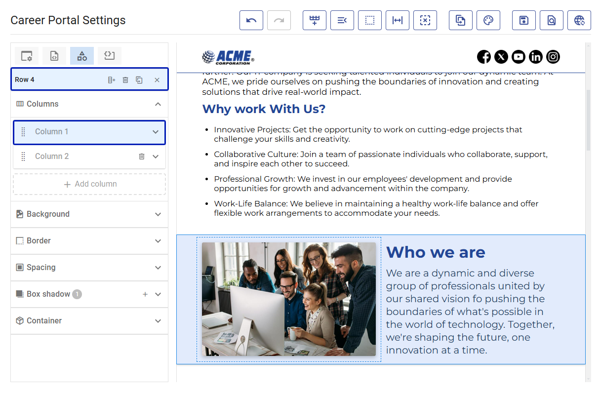
The Content Panel displays row-specific tools, including column settings. For details on rows and columns, see Page Layout.
Saving vs Publishing
The Portal Designer offers two options for saving your work:
- Save: Saves changes to a draft version, visible only to you. The Preview action automatically saves changes to the draft first.
- Publish: Saves changes and makes them live, ensuring candidates see the latest version.
You can enable automatic saving and revert changes to the last published state. For more details, see Editing Preferences.
Action bar
The Action Bar at the top of the interface provides quick access to essential features:
Design Tool
The Design Tool is divided into four sections, accessible via buttons at the top:
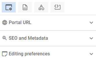
Portal settings and preferences
This section includes:
- The portal URL and custom domain options.
- SEO and Metadata settings to optimize portal visibility.
- Editing Preferences for customizing your design workflow.
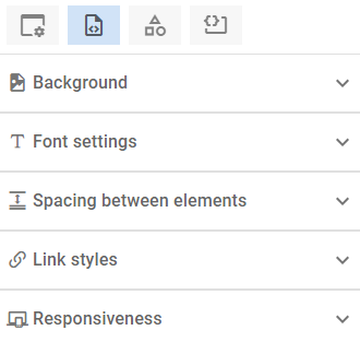
Page body and styles
This section lets you define global portal settings, including:
- Page body styles, such as typography and background.
- Viewport breakpoints and container widths for optimal responsiveness.
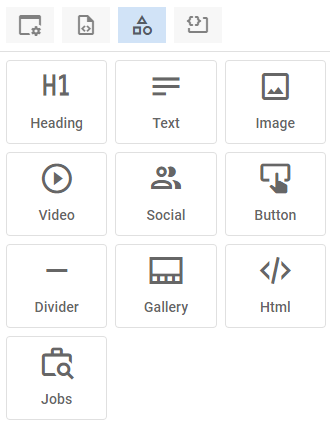
Content
The behavior of this section changes based on selected elements:
- No Selection: Displays all available content elements.
- Content Selected: Shows customization tools for the specific element.
- Row Selected: Displays tools for managing rows and their columns.
Click the Close icon to reset to the default content list view.
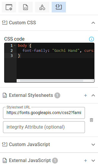
Custom JavaScript and CSS
Add custom code to enhance your portal’s functionality or integrate third-party services. For details, see Custom CSS and Custom JavaScript.
Editing preferences
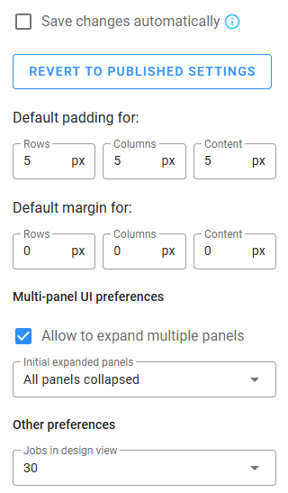
Before designing your portal, adjust editing preferences in the "Portal settings and preferences" panel for a smoother experience. These settings, stored on your device, include:
- Save Changes Automatically: Enable auto-saving every 10 seconds.
- Revert to Published Settings: Roll back changes to the last published version.
- Default Padding and Margin: Set default values for rows, columns, and content.
- Expand Multiple Panels: Allow multiple settings panels to remain open simultaneously.
- Initial Expanded Panels: Choose how panels behave upon opening a section.
- Jobs in Design View: Set how many jobs are visible for testing layout and pagination.
Templates
If you don’t want to build your design from scratch, use the Template Browser to quickly apply a new design to your page. Open the dropdown to see the list of available templates. When you select a template, a preview image will appear below to help you decide. To apply the template, click Apply. Before the change is made, a confirmation dialog will explain that your current design and content will be replaced, while your SEO settings, metadata, custom CSS, and JavaScript will remain unchanged. If Save changes automatically is enabled, the update will be saved immediately.
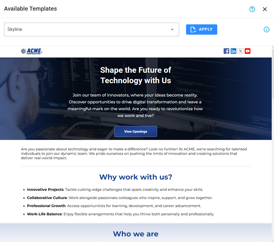
After applying a template, you can quickly change the colors and font families using the tool below.
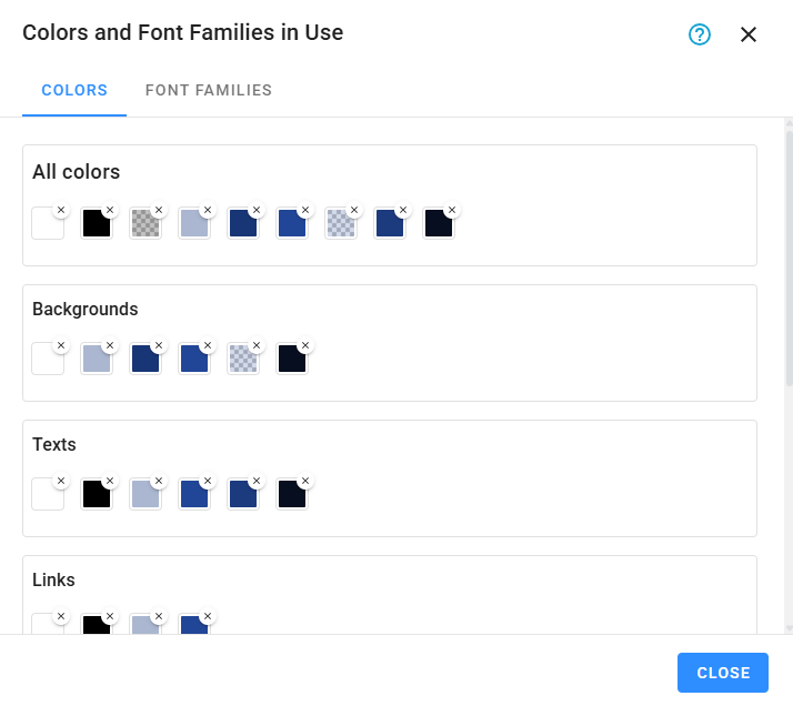
Color Palette and Fonts
To manage all the colors and font families used in your design, open Color Palette and Fonts. This view is divided into two panels:
Colors
Replace or remove colors used in a specific category or across all categories.
Font Families
Replace font families used in a specific category or across all categories.
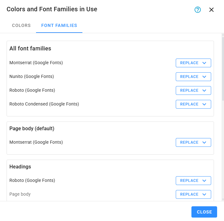
This tool helps you keep your design consistent and makes it easy to apply bulk changes. Note that changes take effect immediately and will be saved automatically if Save changes automatically is enabled.