
Advanced Design Concepts
This page summarizes advanced concepts to customize your career portal design, such as applying specific link styles within a section or vertically aligning content across adjacent columns. It also explores responsiveness in detail, offering tools to ensure a modern, adaptable web design.
Responsiveness
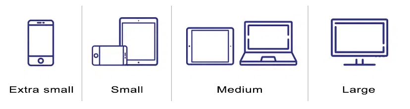
The Career Portal Designer in Zamdit is built to ensure your portal looks professional and functions effectively across various devices and screen sizes. It includes tools to customize the design for four viewport categories: Extra small, Small, Medium, and Large. These tools help you create a responsive portal that enhances your employer brand and provides a seamless user experience.
You can adjust the Design View width to test responsiveness and use the preview feature to simulate how your portal appears on different devices before publishing.
Breakpoints and responsive containers
Start by accessing the Responsiveness panel in the Page Body and Default Styles section to define breakpoints for the viewport categories.
After setting breakpoints, adjust container settings by viewport. Responsive containers ensure your page adapts seamlessly to different screen sizes. You can define the container’s maximum width (pixels), percentage width (allowing horizontal margins), and internal horizontal padding (left and right) to optimize the layout for any device.
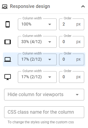
Columns responsive settings
Page layouts are built using rows and columns. Rows can contain multiple columns that wrap onto new lines as needed. With a 12-column grid system, you can customize column widths for each viewport, change the order of columns, or hide specific columns on certain devices, ensuring a consistent and visually appealing design.
Container dimension settings
In the Advanced settings for content elements, you can customize the container's dimensions for all viewports collectively or individually for each viewport. These settings apply to either the width or height of the container, depending on whether the content elements within the column are arranged horizontally or vertically.
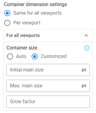
Image galleries
Zamdit offers three versatile image galleries to enhance your portal's visual appeal: Carousel, Side by Side Images, and Masonry Layout. These galleries adjust to container widths, with settings to optimize their display for different viewports:
- Image Captions: Enable captions selectively for specific viewport categories.
- Image Height: Define heights for Carousel and Side by Side Images galleries to maintain alignment.
- Columns and Arrangement: For Masonry Layout galleries, set the number of columns and their arrangement per viewport.
Containers vs elements
Content elements are placed within container boxes inside columns. Columns can host multiple content elements, each within its container. Containers can be customized independently for borders, spacing, and shadows.
The Design Tool distinguishes container and element customization, with overlapping settings for attributes like button styles.
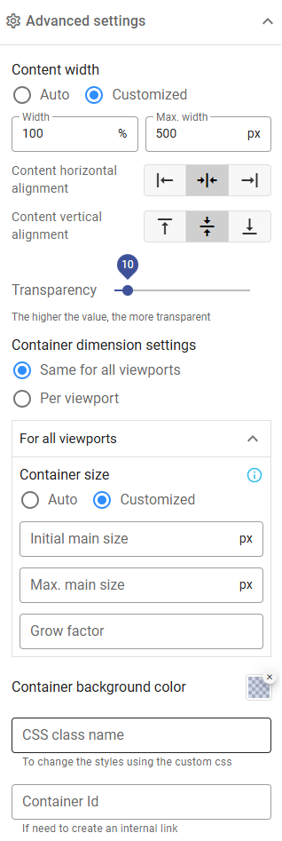
Advanced settings
The Advanced Settings panel offers tools to refine your design:
- Content Width: Adjust content width (percentage) and maximum width (pixels).
- Horizontal Alignment: Align content within containers horizontally.
- Vertical Alignment: Align content within containers vertically. To match container heights across columns when content elements are stacked vertically, set the "Grow Factor" field to a value of 1 in the container dimension settings.
- Transparency: Add transparency to containers and content.
- Container dimension: Adjust the container's main size for all viewports or individually for each viewport. Hover over the info icon for additional details.
- Background Color: Set container background colors.
- CSS Class Name: Assign custom class names for applying CSS styles.
- Container ID: Assign unique IDs for creating internal links or accessing elements via custom JavaScript code.
CSS class names and IDs must follow specific rules: begin with a letter (A–Z or a–z), followed by letters, digits (0–9), hyphens (-), or underscores (_). IDs must be unique.
Custom CSS
While the Portal Designer offers extensive design options, it doesn’t cover all CSS3 features, such as animations or transformations. You can add custom CSS code by assigning class names to rows, columns, or containers:
- Rows: Specify class names for rows or their internal containers.
- Columns: Define class names in the Responsive Design panel.
- Content Elements: Apply custom styles in the Advanced Settings panel.
You can include external stylesheets by providing their URL and, if applicable, an integrity attribute. This feature is useful in various scenarios, such as when you want to use fonts that are not included in the list of available options.
Note: Custom CSS code and external stylesheets do not appear in the Design View. Use the preview feature to fully test and verify all styles.
Custom JavaScript
Custom JavaScript allows advanced functionality:
- Enhanced Flexibility: Add unique features beyond built-in options.
- Brand Consistency: Integrate third-party tools like analytics or widgets.
- Improved Experience: Include interactive elements for a dynamic user experience.
You can add custom JavaScript in two ways:
- Enter the JavaScript code directly into the editor. The script always executes after the page elements have finished loading, so avoid including functions that depend on the
onloadevent of the<body>element. - Include external scripts by specifying their source URL, loading method, and, if applicable, an integrity attribute.
Ensure that your custom scripts are optimized and secure to avoid performance or security issues.
Note: Custom or external scripts are not displayed in the Design View. Use the preview feature to test their functionality.