Promoting Open Positions
The Career Portal in Zamdit is designed to automatically showcase your open positions, streamlining the promotion of your opportunities to potential candidates. To maximize the impact of this feature, it's essential to customize the design of the job listing components so they seamlessly integrate with your portal's layout and reflect your company's branding. By aligning these elements with the overall page design, you ensure a cohesive and professional appearance that enhances your employer brand and creates a positive, engaging experience for visitors.
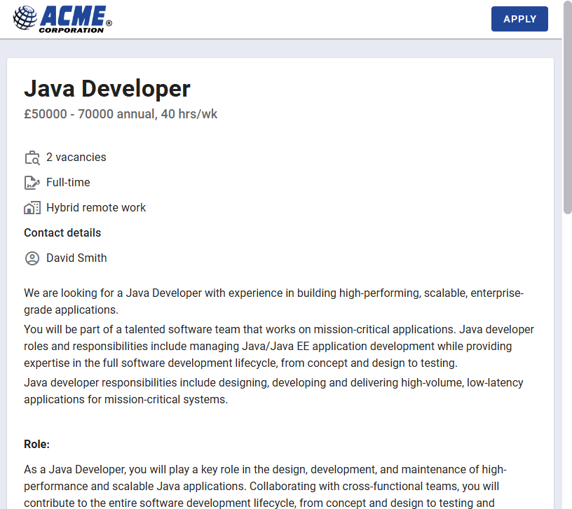
When job seekers click on one of the available positions, they are redirected to a page where they can read the job description and apply if they are interested in the position.
Adding your public jobs
To display public jobs in your career portal, you only need to add the built-in element Jobs. This highly customizable element generates cards for each available position, allowing you to configure their appearance and the fields displayed. You can also enable pagination and customize all its design details.
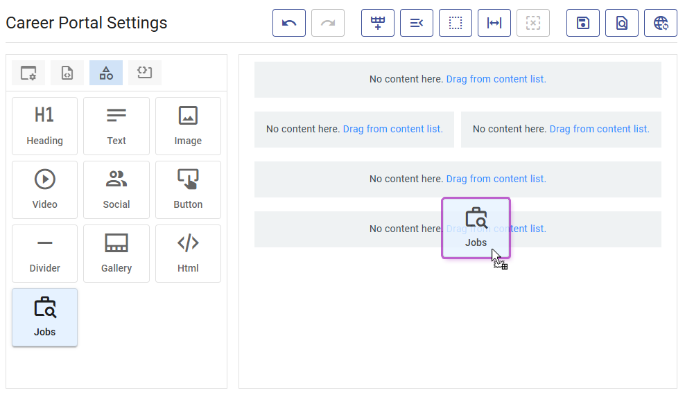
When adding a Jobs element to your Design View, Zamdit won't display your open positions in that view. Instead, it uses predefined positions for testing purposes. The number of positions displayed can be configured in the Editing Preferences section. Adjusting this number allows you to test pagination and the text displayed when there are no open positions.
To align the appearance of this element with the overall page design, you can customize all its components.
Customizing job listings
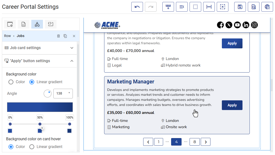
Select the Jobs element to begin customization. Two panels in the Design Tool allow you to configure the job cards and the button inside the cards.
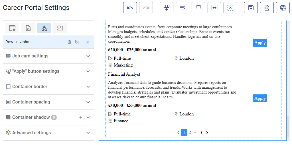
Job card settings
This panel contains a section at the top to configure the key aspects of the card and multiple panels for customizing the card's appearance, including fonts, borders, spacing, and pagination.
The Job Title is always displayed at the top, along with the "Apply" button. All other fields are optional, and you can select which ones to include. Additional fields are divided into three groups and displayed in the following order:
- Summary, displayed below the Job Title.
- Salary and Hours per week, displayed on the same line.
- Location, Contract Type, Department, Work Style, Vacancies, and Language, displayed with an icon on their left using multiple responsive columns. The display order matches the selection order.
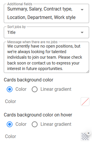
In the top section, you can also specify the sort criteria for jobs, the message to display when no jobs are available, and the background colors for cards in their normal and hover states.
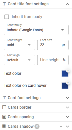
Cards appearance
There are five panels to customize the card's appearance, using the same tools as other content elements. Most include additional settings for hover states. Two separate tools allow you to customize font settings for the Job Title and other fields. Note that the Summary is displayed slightly lighter, while Salary and Hours per week appear slightly bolder.
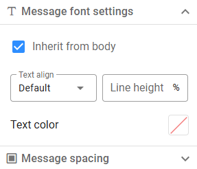
No jobs message appearance
When no jobs are available, the message you provide will be displayed (a default message is used if left blank). Customize the font settings and container spacing to match your page design.
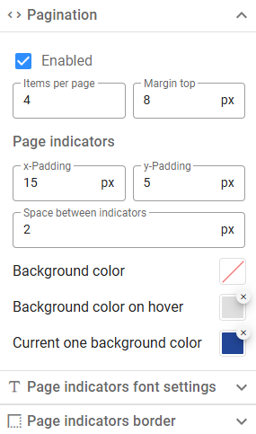
Pagination
If you typically have many open positions, consider enabling pagination. Define how many items to display per page and customize the appearance of the pagination indicators based on their various states.
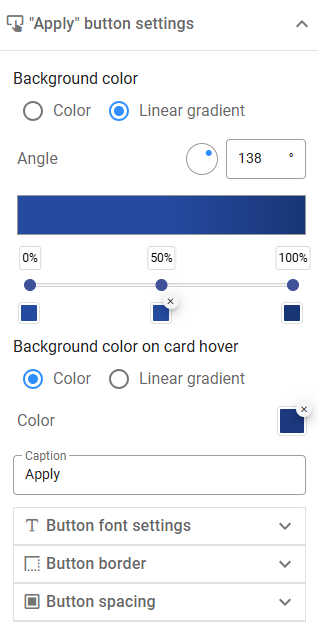
"Apply" button settings
The "Apply" button is always displayed on job cards. However, job seekers can click anywhere on the card to navigate to the job description page. Tools for customizing the button are similar to those for button elements.