Customization Tools
Zamdit provides multiple tools to customize the page body, rows, columns, and content. These tools are displayed in expandable panels within the Design Tool section. The available tools vary depending on the type of element selected. Specific tools for Image Galleries, Jobs, and elements' Advanced Settings are covered on their respective pages.
All content elements, regardless of type, are placed into a box container. You can always customize the container’s borders, spacing, and shadows. The corresponding panels are named Container Border, Container Spacing, and Container Shadow to differentiate them from the settings for content elements (such as buttons) that also support these customizations.
Font Settings
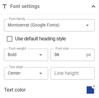
Use this tool to define the Font Family, Weight, and Size (in pixels) for the page body and elements that display text. Additionally, you can adjust Text Align, Line Height (in percentage), and Text Color. Available font families include 9 Web-Safe Fonts and 50 common Google Fonts.
The values specified for the Page Body act as default settings for any new content elements you create. Additionally, if you set the Font Family to Default or leave the Line Height blank, the values defined for the Page Body will be applied. If these fields were not specified in the Page Body settings, the browser’s default values will be used instead.
To make sure body font weight and size are always applied, even if changes are made later, select the checkbox Use body font style.
For Heading elements, you can select the checkbox Use default heading style to apply the browser’s default font weight and size for each heading level.
Background Settings
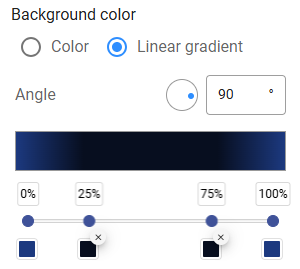
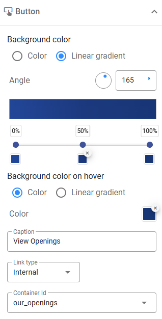
Customize the background of the page body, rows, and columns. Zamdit supports Single Background Colors, Linear Gradients, and Background Images, with additional options like image transparency and repetition settings.
For Linear Gradients, you can define up to 7 stops, assigning colors and positions to each. Specify the gradient’s angle using degrees, where 0°, 90°, 180°, and 270° correspond to "to top", "to right", "to bottom", and "to left", respectively.
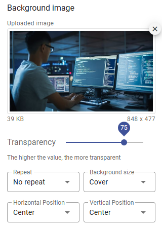
Background images can be added from your file system or via a remote URL. Customize transparency for creative effects, and configure options such as repetition, size, and position:
- Repeat: Controls how the background image repeats.
- Background Size: Determines how the image fits within the container:
- Auto: Displays the image at its original size.
- Cover: Resizes the image to fill the container, potentially cropping it to preserve its aspect ratio.
- Contain: Resizes the image to ensure it is fully visible within the container.
- Horizontal Position: Adjusts the image’s position on the x-axis.
- Vertical Position: Adjusts the image’s position on the y-axis.
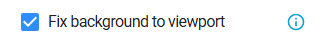
For linear gradients and background images, you can choose to fix the background relative to the viewport, so it stays in place as you scroll instead of moving with the section. Note that images may appear wider than expected in the editor; be sure to preview your design to see how it will look in the browser.
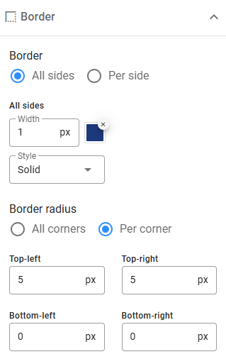
Borders
Define border width, color, style, and radius for elements. Only pixel values are supported for width and radius. Select from the available border styles, and customize settings either uniformly for all sides or individually for each side or corner.
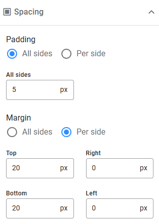
Spacing
This tool allows you to configure paddings and margins (in pixels). Set uniform values for all sides or customize each side independently. For consistent spacing across rows, columns, and content, define default padding and margin settings in the Editing Preferences section.
Shadows
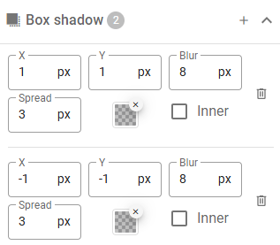
Zamdit supports applying shadows to boxes (e.g., columns, rows, containers, images) and text. Add multiple shadows to an element by clicking the Add icon and remove them with the Delete icon. Shadows are applied in the order they are added.
Text shadow settings are similar to box shadow settings but exclude Spread and Inset. Shadow properties include:
- X: Horizontal offset (pixels). Negative values move the shadow to the left of the element.
- Y: Vertical offset (pixels). Negative values move the shadow above the element.
- Blur: Determines the softness and spread of the shadow's edges. A value of
0creates a sharp, hard-edged shadow. As the value increases, the shadow becomes larger and softer, with a gradual fade at the edges, creating a more diffused effect. - Spread: Adjusts the overall size of the shadow. Positive values expand the shadow, making it larger than the element. Negative values shrink the shadow, pulling it closer to the edges of the element.
- Color: Sets the shadow's color, often combined with transparency for subtle effects.
- Inset: Positions the shadow inside the box border (even if the border is transparent), appearing above the background but below the content.
Spacing Between Elements
This tool allows you to adjust the spacing between block-level elements in text, such as paragraphs, lists, and blockquotes, as well as between items in ordered or unordered lists. The margin is expressed in 'em', a unit of measurement relative to the surrounding text. Default values can be set in the body settings, and specific text content elements can have their margins overridden if needed.
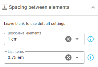
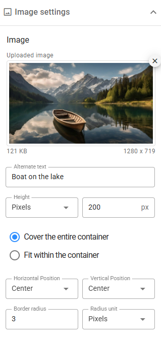
Image Settings
Add images from your file system or specify remote URLs. Customize images using the following options. Note that settings related to the width and height of the container in Advanced Settings will impact the final result.
- Height: Define height in pixels, percentages, or use Auto or Fit for responsive design.
- Fit: When height isn’t set to Auto, maintain the aspect ratio while fitting or covering the container.
- Position: Adjust image alignment within the container on both axes.
Other features include Border Radius, Alternative Text, Filters, and Links.
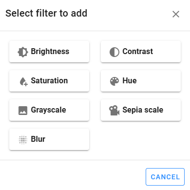
Filters
Apply visual effects like blur or color shifts using 7 filter types. Add filters with the Plus icon, reorder them via drag-and-drop, and see changes applied immediately.
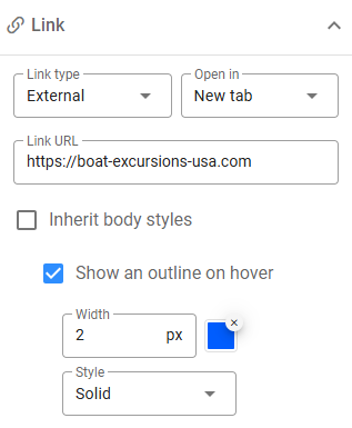
Links
Hyperlink images to external URLs, email addresses, or internal container IDs (available in Advanced Settings). For external links, you can open in a new tab, while internal links require valid container IDs.
You can also customize hover outlines, inheriting body styles or defining unique hover settings.
Button Settings
Buttons link to external pages or internal sections. Customization options include single colors or linear gradients for normal and hover states. For more on linear gradients, see Background Settings. Link settings are similar to those described in the Links section.
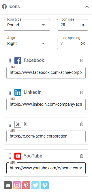
Social Icons Settings
Easily add icons for common social networks with this built-in tool. Select networks, define URLs, and customize size, alignment, and style. Reorder or delete icons using drag-and-drop or the Delete icon.
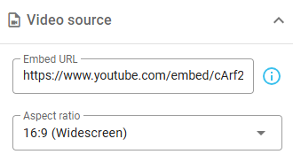
Video Settings
Embed videos using URLs from supported platforms like YouTube and Vimeo. Paste embed URLs (e.g., from <iframe> tags) directly. The system ensures a responsive video display.