Using Image Galleries
Image galleries in a career portal page are a versatile way to visually enhance your employer brand and engage potential candidates. By showcasing company culture, team activities, office spaces, or events, image galleries help bring your workplace to life and create a compelling narrative for applicants. In Zamdit, you can design custom image galleries that seamlessly integrate into your career portal, aligning with your brand while ensuring an engaging and professional presentation that appeals to top talent.
Zamdit offers three gallery types to elevate your career portal's visual appeal and functionality: Carousel, Side by Side Images, and Masonry Layout. Each gallery type provides unique features to suit various design preferences and content needs, allowing you to display images effectively—whether highlighting key moments, presenting a clean and organized layout, or embracing a dynamic and creative aesthetic.
Common Settings
When you add an Image Gallery to your page, the Design Tool includes at least two panels for configuring the gallery:
- Gallery Settings, where you define the gallery type and related options, and
- Images, where you upload and manage your gallery images.
If image captions are allowed and set up, two additional panels become available: Font Settings and Caption Text Shadows.
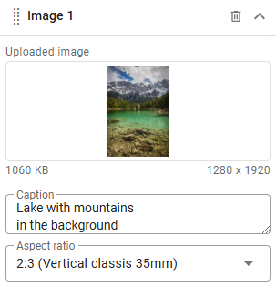
Images can be reordered as needed. Depending on the gallery settings, you can add captions, alternative text, displayed aspect ratios, or hyperlinks to images. You can also apply a border radius to all images from the Gallery Settings panel. Similar to adding an Image Content, you can upload images from your file system or specify remote URLs. If your images have varying sizes or aspect ratios, the tools include settings to ensure they display in an appealing and consistent manner.
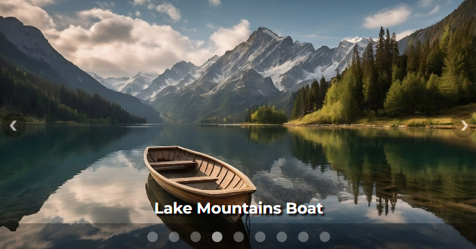
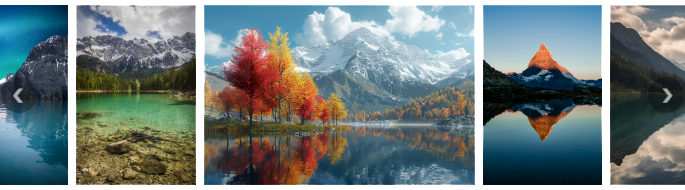
Carousel
A Carousel gallery is a slideshow for cycling through images, showing only one image at a time. Images automatically adjust their width to fit the container, while their height can either adapt based on the image size (Adaptive height) or be manually defined for each viewport category. If manually set, images may be cropped to maintain their aspect ratio.
Optional features include:
- Delimiters (also called indicators) to help users navigate between images, and
- Image captions, which can be displayed at the bottom based on the selected viewports.
Side by Side Images
A Side by Side Images gallery displays images next to each other, offering two layout modes:
- Slider: Images are arranged in a single horizontal line, with navigation buttons on either side to view hidden images. The slideshow can be set as infinite or single pass.
- Flexible Grid: A responsive layout that wraps images onto multiple lines, making all images visible at once.
For both layout modes:
- You must define image height for each viewport to ensure alignment, regardless of the original image size or aspect ratio.
- Images will scale to fit the specified height while maintaining their aspect ratio.
- You can also configure padding between images for a cleaner look.
In Flexible Grid mode, you can additionally:
- Align images horizontally.
- Enable the "Fill Container Width" option to ensure images in each row span the full width of the container. (Note: This option may crop images to maintain their aspect ratio.)
- Add hyperlinks to images, useful for scenarios such as creating your own Social Icons.
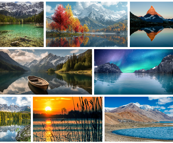
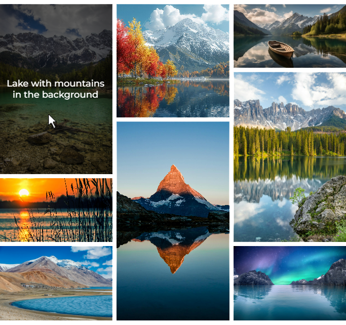
Masonry Layout
Masonry Layout Galleries arrange images by columns, unlike Flexible Grid, which organizes them by rows. This gallery type offers options such as:
- Displaying captions on top of images when hovered.
- Defining the number of columns and customizing their configuration for each viewport category.
Images can be arranged across columns using one of three methods:
- From left to right
- From top to bottom
- Manually (drag-and-drop to create a custom arrangement).
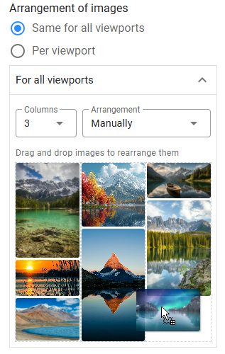
To accommodate varying image aspect ratios, you can assign predefined aspect ratios to images, using them strategically to ensure columns have consistent heights and create a balanced layout. The tool offers a wide range of aspect ratio options for both horizontal and vertical formats.
By carefully selecting the number of columns for each viewport, fine-tuning aspect ratios, and thoughtfully arranging images with balanced proportions, you can design stunning and cohesive masonry layouts.