
Designing Your Portal
Creating a seamless and engaging experience for candidates begins with your careers portal. Zamdit's no-code Portal Designer empowers you to build a professional, branded careers portal effortlessly. Whether you want to highlight your company culture, showcase open positions, or provide an intuitive application process, the Portal Designer offers all the tools you need.
Start by setting up your page and general settings. Then, create your layout by adding rows and columns, and finally, drag and drop all your content elements into position. All page elements can be customized using the intuitive tools and a rich text editor for content formatting. Rows and content can be easily rearranged by dragging and dropping them. For a general overview of the tool, we suggest first reading Using the Portal Designer.
Page Body and Styles
Page Body and Styles is the second section of the Design Tool. It includes five panels we recommend configuring before starting to design your portal page:
- Background: Define the page body background styles.
- Font Settings: Set the default font family, weight, and size for the portal, along with other font-related settings. These defaults will apply to new content added to the portal.
- Spacing Between Elements: Configure default margins between block-level elements (e.g., paragraphs, lists, blockquotes) and list items. You can override these margins for specific content elements when needed.
- Link Styles: Customize styles that represent link states (normal, hover, active, visited). Additionally, set default styles for images with links, which can be overridden for specific images if needed.
- Responsiveness: Configure responsive design settings for four viewport categories: Extra small, Small, Medium, and Large. Adjust the breakpoints to suit your design needs and set container width (percentage), maximum width (pixels), and horizontal padding (left and right). These settings help ensure your design adapts seamlessly to any device. For more information, see Responsive Design.
Page Layout
The first step in designing your page is defining the layout, which determines how visual elements are structured and positioned. Layouts are created by adding rows and columns.
Rows span the full width of the page and contain an internal container. Depending on the row configuration, this container can be fluid, extending across the entire row, or constrained according to the responsive settings defined in the Body settings for each viewport.
Columns are placed inside the container. They follow a responsive 12 column grid system, allowing you to define column widths independently for each viewport category. If the available space is insufficient, columns automatically wrap onto multiple lines.
Content elements are added inside columns. While multiple elements can share the same column, each element is placed within its own content container. Elements within a column can be arranged either vertically or horizontally, depending on the selected layout direction.
The image below illustrates the different components of a page layout. The white area represents the row, the red area represents the responsive container, the green areas represent the columns, and the blue areas represent the content containers and their elements.
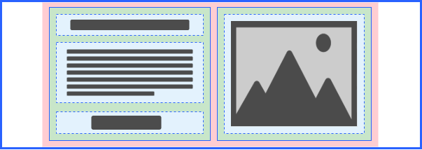
When the Layout Outline feature is active, or when an element is hovered over or selected, only rows, columns, and content containers are outlined. These outlines use thick solid, thin solid, and dashed lines, respectively, as shown in the images above.
Adding and Editing Rows
To add a row, click the Add Row button on the Action Bar.
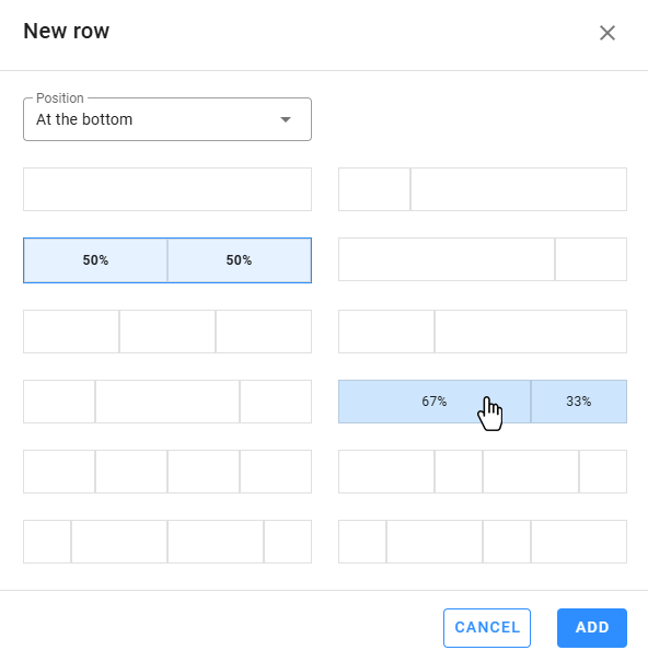
- Select the row's position on the page (above, below, or at a specific location).
- Choose a column arrangement for the row. The selected arrangement applies to larger devices, but widths may adjust for smaller devices like phones or tablets. After adding the row, check column widths for each device to ensure they align with your design.
Note: New rows are not auto-selected after creation. You'll need to manually select them to edit. To select a row, you can:
- Use the breadcrumb trail in the Design Tool when an inner content element is selected.
- Click the edit icon on the floating menu bar.
- Select blank spaces within the row.
The Content Panel will display row customization tools, including settings for columns, background, borders, spacing and shadows. Row-specific tools include Columns and Container Settings, detailed below.
Columns
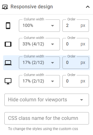
Manage columns within a row by adding, removing, or reordering them. Each column has customization options for background, borders, spacing, and shadows. You can also define in the Responsive Design panel:
- Column widths for each viewport category, allowing you to change the column order for different viewport categories. (The highlighted viewport category corresponds to the current viewport in the Design View.)
- Visibility settings to hide columns for specific viewports.
- Custom CSS class names for advanced styling (see Custom CSS).
⚠️ Warning
When adding new columns to an existing row, keep in mind that the widths of the current columns may adjust automatically, depending on the device, to fit the new column. After adding columns, review the Responsive design panel for all columns in the row to ensure the assigned values are as expected. In some cases, it may be better to duplicate an existing column, as this won’t change the widths of the other columns and will create an exact copy of the selected column.
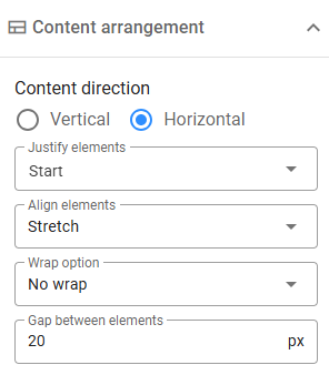
A dedicated panel allows you to configure how content elements are arranged within a column using Flexbox, a one-dimensional layout method for item arrangement. It supports two directions: horizontal and vertical, as well as settings for justification and alignment. Additionally, you can specify a gap (in pixels) between elements and enable wrapping for horizontal arrangements.
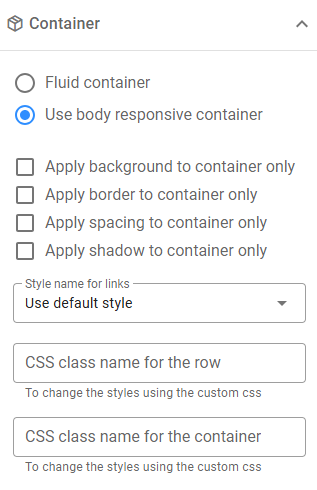
Container Settings
By default, the container inside a row aligns with the Responsive Container, but you can create fluid containers that span the entire page width. Compare the following:
- Body Responsive Container: Content elements are constrained to the body container.

- Fluid Container: The Image Gallery extends across the page width.

You can adjust container styles independently and assign custom CSS class names to rows or containers if necessary. If the link styles within a row differ from the default link styles, you can define new styles in the body Link Styles section, assign them a CSS class name, and apply these styles to the row by selecting the class in the Style name for links field.
Additional Row Actions
When a row is selected, you can use the Design Tool's top bar to perform the following actions:
- Duplicate: Create an exact copy of the row, including its columns and all contained content.
- Delete: Remove the row. If deleted by mistake, you can undo the action.
The same actions are available from the row's Floating menu bar when you hover over it. Additionally, you can use the Reposition Handle to drag the row to a new position on the page.
To delete or move individual columns, first select the row, then navigate to the Columns panel in the Design Tool.
Page Content
After configuring the layout, drag and drop content elements into columns. Multiple elements can share the same column and will be arranged horizontally or vertically based on the column's configuration (the default arrangement is vertical stacking).
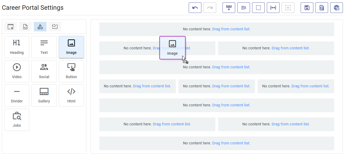
To access the content list, click Drag from content list. This action will also deselect any currently selected row or element.
Available Content Elements
Zamdit supports the following content elements:
- Heading: H1–H5 headings.
- Text: Rich text blocks with formatting and links.
- Image: Add images from URLs or your file system.
- Video: Embed videos using URLs.
- Social: Add icons for common social media networks.
- Button: Customizable buttons for navigation.
- Divider: Horizontal rules for content separation.
- Gallery: Image galleries supporting Carousel, Side by Side, and Masonry layouts.
- HTML: Add custom HTML content.
- Jobs: Display public open positions.
Adding and Editing Content
Drag elements from the content list to the desired column. Select an element to open its customization options in the Design Tool. Tools vary by element type but generally include common style settings and type-specific attributes.
For details, see Customization Tools.
Additional Content Actions
For selected content elements, use the Design Tool's top bar to:
- Duplicate: Create an identical copy of the element immediately below the original.
- Delete: Remove the element. As with rows, you can undo this action if needed.
To move a content element, hover over it to reveal the Reposition Handle at the top. Drag the element to reposition it within the same column or move it to a different column. The final placement depends on where you drop it:
- If dropped within the same column, the element will be positioned directly to the left of or above the target element.
- If moved to a new column, it will be placed below or to the right of the target element.